Frame
For building compound micro-layouts.
Prototype
Slot name: content
Your content goes here
Description
The SageFrame component is set up to mirror configurations found in the auto layout feature of Figma, which is commonly used to create compound layouts.
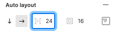
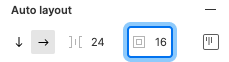
When you select a group, component, or artboard layer in Figma, look in the sidebar on the right side of the interface under the Design tab for this panel (You will need Edit access to a Figma file in order to access the Design tab to see this panel):
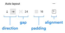
These four sections correspond to properties with the same name on the SageFrame component (see the Properties below). You can therefore easily match a layout from a Figma design by using a SageFrame with the same settings.
Properties
| Name | Description | Type | Default | ||||||||||||||||||||||||||
|---|---|---|---|---|---|---|---|---|---|---|---|---|---|---|---|---|---|---|---|---|---|---|---|---|---|---|---|---|---|
|
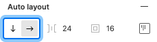
| Configures how the items within the Frame align based on the direction of flow. Corresponds to Figma auto layout setting:
|
|
| ||||||||||||||||||||||||||
|
| Provide a background color for the Frame if desired. | String, (valid CSS background setting such as a hex value) |
| ||||||||||||||||||||||||||
|
| Provide a border setting from one of the available border types. |
|
| ||||||||||||||||||||||||||
|
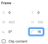
| Provide a border radius from one of the available border radius types. Corresponds to Figma setting:
|
|
| ||||||||||||||||||||||||||
|
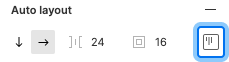
| Set which direction the Frame contents should flow. Corresponds to Figma auto layout setting:
|
|
| ||||||||||||||||||||||||||
|
| Set up an even gap between all items in the Frame. Corresponds to Figma auto layout setting:
|
|
| ||||||||||||||||||||||||||
|
| Add spacing between the Frame edge and its contents. Corresponds to Figma auto layout setting:
|
|
| ||||||||||||||||||||||||||
|
| Provide the HTML tag you want the Frame to output. | String (HTML tags) |
| ||||||||||||||||||||||||||
|
| Provide a width setting either from a preset or as a CSS length value. |
|
|
 or
or 
 or
or 
 or
or 
 or
or 
 or
or 
 or
or 
 or
or 
 or
or 
 or
or 
 or
or 
 or
or 
 or
or 


Simple Stack
SageFrame has a default vertical direction, which means that child items will stack one on top of another.
It also has a default gap of sm (16px). In the example below we modify this to a smaller xs (8px) value,
which is commonly used in design for simple stacked content.
<%= sage_layout SageFrame, { gap: "xs" } do %>
  <%= sage_component SageProperty, {
    icon: "user",
    value: "Galinti Marcus",
  } %>
  <%= sage_component SageProperty, {
    icon: "mail",
    value: "[email protected]",
  } %>
  <%= sage_component SageProperty, {
    icon: "star",
    value: "Member since 2022",
  } %>
<% end %>
Simple Row
By setting direction: "horizontal" you can change SageFrame to lay out its children in a "row".
<%= sage_layout SageFrame, { direction: "horizontal" } do %>
  <%= sage_component SageProperty, {
    icon: "user",
    value: "Galinti Marcus",
  } %>
  <%= sage_component SageProperty, {
    icon: "mail",
    value: "[email protected]",
  } %>
  <%= sage_component SageProperty, {
    icon: "star",
    value: "Member since 2022",
  } %>
<% end %>
Bordered Box
Another common design element is a bordered box.
While contents may vary greatly, you can use any combination of border, border_radius, and padding
to achieve common configurations.
Here is one of the most common:
<%= sage_layout SageFrame, {
  border: "default",
  border_radius: "md",
  padding: "md",
} do %>
  <%= sage_component SageProperty, {
    icon: "user",
    value: "Galinti Marcus",
  } %>
  <%= sage_component SageProperty, {
    icon: "mail",
    value: "[email protected]",
  } %>
  <%= sage_component SageProperty, {
    icon: "star",
    value: "Member since 2022",
  } %>
<% end %>
Nesting Frames
More complex (read: fun!) layouts can be achieved by nesting Frames.
In such cases it can also be helpful to make use of the width property
in order to control the dimensions of the nested items.
In the example below, the outermost Frame adds border treatment, padding, and a horizontal direction to form a row.
Within this are two Frames:
one is set with a fixed width and contains a graphic placeholder;
the other contains text content with a xs gap.
Nested within this content Frame is another frame to contain the "header" items and a gap: "none"
that visually groups the heading and subtext better apart from the larger paragraph that follows.

Lorem ipsum dolor sit
Consectetur adipiscing elit
Aliquam rhoncus ipsum massa, a tempor arcu elementum sed. Nullam tortor odio, ullamcorper vel elementum in, luctus et tortor. Nullam tellus orci, euismod ultricies odio ut, volutpat fermentum diam. Proin rhoncus sit amet felis nec iaculis. Fusce aliquet augue eget semper ultrices.
<%= sage_layout SageFrame, {
  border: "default",
  border_radius: "md",
  padding: "md",
  direction: "horizontal",
  align: "center-left"
} do %>
  <%= sage_layout SageFrame, { width: "160px" } do %>
    <%= image_tag("card-placeholder-sm.png", alt: "", style: "max-width: 100%") %>
  <% end %>
  <%= sage_layout SageFrame, { width: "flex", gap: "xs" } do %>
    <%= sage_layout SageFrame, { gap: "none" } do %>
      <h4 class="<%= SageClassnames::TYPE::HEADING_3 %>">
        Lorem ipsum dolor sit
      </h4>
      <p class="<%= "#{SageClassnames::TYPE::BODY_SMALL} #{SageClassnames::TYPE_COLORS::CHARCOAL_200}" %>">
        Consectetur adipiscing elit
      </p>
    <% end %>
    <p class="<%= SageClassnames::TYPE::BODY %>">
      Aliquam rhoncus ipsum massa, a tempor arcu elementum sed.
      Nullam tortor odio, ullamcorper vel elementum in, luctus et tortor.
      Nullam tellus orci, euismod ultricies odio ut, volutpat fermentum diam.
      Proin rhoncus sit amet felis nec iaculis.
      Fusce aliquet augue eget semper ultrices.
    </p>
  <% end %>
<% end %>
Flexible Width Ratios
Sometimes a width that is proportionate to a given space is preferred over a fixed pixel width.
In such cases the width_ratio property can be used to provide such a ratio.
This property maps directly to the CSS flex property.
Generally speaking, provide an integer that represents that item's ratio to other items.
For example, as shown below, a typical 2/3 + 1/3 column set up can be set up
with the wider column set to width_ratio: 2 and the narrower one set to width_ratio: 1.
Similarly, if you want three items that flex with the same width, set all three to width_ratio: 1.
Ratio of "2"; This side is 2 / 3
Ratio of "1"; This side is 1 / 3
<%= sage_layout SageFrame, { direction: "horizontal" } do %>
  <%= sage_layout SageFrame, {
    width_ratio: "2",
    border: "default",
    border_radius: "md",
    padding: "md"
  } do %>
    <p>Ratio of "2"; This side is 2 / 3</p>
  <% end %>
  <%= sage_layout SageFrame, {
    width_ratio: "1",
    border: "default",
    border_radius: "md",
    padding: "md"
  } do %>
    <p>Ratio of "1"; This side is 1 / 3</p>
  <% end %>
<% end %>
Equally-sized Flexing Items
Similar to the prior example, if you want several items that flex with the same width,
set all to the same value such as width_ratio: 1.
This element is 1 / 3, flexing with the other items.
This element is 1 / 3, flexing with the other items.
This element is 1 / 3, flexing with the other items.
<%= sage_layout SageFrame, { direction: "horizontal" } do %>
  <%= sage_layout SageFrame, {
    width_ratio: "1",
    border: "default",
    border_radius: "md",
    padding: "md"
  } do %>
    <p>This element is 1 / 3, flexing with the other items.</p>
  <% end %>
  <%= sage_layout SageFrame, {
    width_ratio: "1",
    border: "default",
    border_radius: "md",
    padding: "md"
  } do %>
    <p>This element is 1 / 3, flexing with the other items.</p>
  <% end %>
  <%= sage_layout SageFrame, {
    width_ratio: "1",
    border: "default",
    border_radius: "md",
    padding: "md"
  } do %>
    <p>This element is 1 / 3, flexing with the other items.</p>
  <% end %>
<% end %>
A custom block
Additional customized appearance can be achieved with careful use of background color.
Learn more about products
Lorem ipsum dolor sit amet, consectetur adipiscing elit. Etiam faucibus massa vel sem ullamcorper tincidunt. Vestibulum pulvinar placerat elit, et rutrum ipsum elementum ac.

<%= sage_layout SageFrame, {
  align: "center-spread",
  background: "#fae2d4",
  border_radius: "lg",
  direction: "horizontal",
  padding: "md",
} do %>
  <%= sage_layout SageFrame, {} do %>
    <%= sage_layout SageFrame, { gap: "xs" } do %>
      <h3>Learn more about products</h3>
      <p>
        Lorem ipsum dolor sit amet, consectetur adipiscing elit.
        Etiam faucibus massa vel sem ullamcorper tincidunt.
        Vestibulum pulvinar placerat elit, et rutrum ipsum elementum ac.
      </p>
    <% end %>
    <%= sage_component SageButtonGroup, { gap: :sm } do %>
      <%= sage_component SageButton, {
        value: "Do it!",
        style: "primary",
      } %>
      <%= sage_component SageButton, {
        value: "Cancel",
        style: "secondary",
        subtle: true,
      } %>
    <% end %>
  <% end %>
  <%= sage_layout SageFrame, { width: "104px" } do %>
    <%= image_tag "illustrations/puzzle-small.png", alt: "" %>
  <% end %>
<% end %>
A "stat box"
A wide variety of intricate micro-layouts are possible with Frame.
All payments
40 successful payments
<%= sage_layout SageFrame, {
  align: "start-spread",
  border: "default",
  border_radius: "md",
  direction: "horizontal",
  padding: "sm",
  width: "360px",
} do %>
  <%= sage_layout SageFrame, { gap: "xs" } do %>
    <%= sage_layout SageFrame, { gap: "none" } do %>
      <h3 class="<%= "#{SageClassnames::TYPE::BODY_SMALL} #{SageClassnames::TYPE_COLORS::CHARCOAL_200}" %>">
        All payments
      </h3>
      <%= sage_layout SageFrame, {
        align: "baseline-left",
        direction: "horizontal",
        gap: "xs",
        tag: "p"
      } do %>
        <b class="<%= "#{SageClassnames::TYPE::HEADING_5}" %>">
          40
        </b>
        <span class="<%= "#{SageClassnames::TYPE::BODY_XSMALL} #{SageClassnames::TYPE_COLORS::CHARCOAL_100}" %>">
          successful payments
        </span>
      <% end %>
    <% end %>
    <%= sage_component SageButton, {
      value: "View all",
      icon: { style: "right", name: "arrow-right" },
      style: "primary",
      subtle: true,
    } %>
  <% end %>
  <%= sage_layout SageFrame, {
    align: "top-right",
    gap: "xs",
    width: "120px"
  } do %>
    <%= sage_component SageLabel, {
      color: "published",
      value: "33%",
      icon: "up-small",
    } %>
    <div>
      [chart]
    </div>
  <% end %>
<% end %>